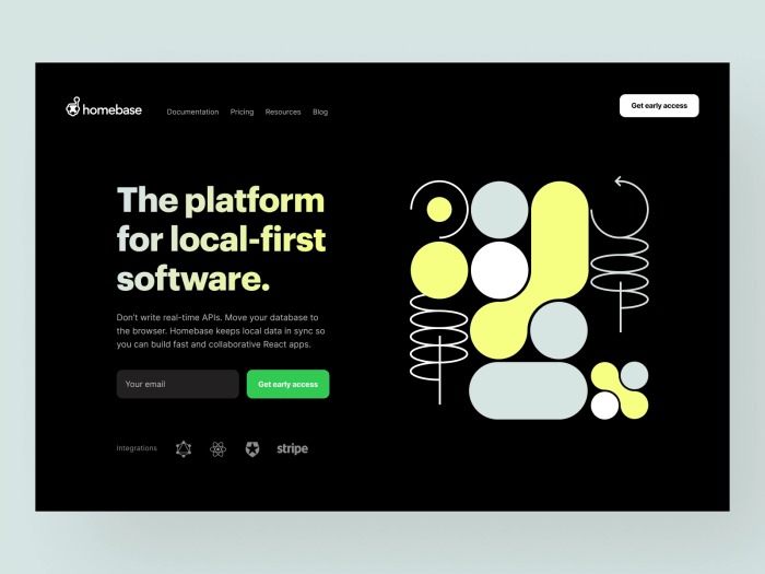
Dark mode web design inspiration has become increasingly popular, captivating both designers and users alike. This contemporary aesthetic not only offers a sleek and visually appealing interface but also enhances user experience by reducing eye strain, especially in low-light environments. By implementing dark mode effectively, websites can create an immersive experience that resonates with modern digital consumers.
As we delve into the principles, benefits, and implications of dark mode, we will explore how this design choice can elevate web accessibility and engagement. With numerous platforms adopting dark mode, understanding its mechanics and impact is essential for every web designer aiming to stay ahead in the digital landscape.
Dark Mode Design Principles
Dark mode has gained significant popularity in recent years, offering a visually appealing alternative to traditional light-themed designs. This design approach not only enhances aesthetics but also provides users with a more comfortable viewing experience, especially in low-light environments. Understanding the fundamental principles of dark mode design is essential for creating user-friendly web interfaces that cater to diverse audience needs.One of the foundational principles of dark mode design is ensuring adequate color contrast between text and background.
This is crucial for readability and overall user experience. Colors in dark mode should be carefully selected to prevent eye strain while maintaining visual hierarchy. A well-implemented dark mode not only supports the visual design but also aligns with accessibility standards, catering to users with varying visual impairments.
Successful Dark Mode Implementations
Various popular websites have successfully adopted dark mode, illustrating the versatility and effectiveness of this design choice. Examples include:
- YouTube: YouTube’s dark mode features a sleek black background that emphasizes video content, allowing users to focus on visuals without distractions. The color contrast provided by white and colored text enhances visibility, making navigation seamless.
- Twitter: Twitter’s dark mode offers a deep navy background, which is less harsh than pure black. This design choice improves readability of tweets while reducing glare from screens, particularly beneficial during nighttime use.
- Slack: Slack employs dark mode to create a modern interface that is easy on the eyes. The application’s color palette is carefully crafted to help users differentiate between different types of content, ensuring efficient communication in a visually structured manner.
Impact of Color Contrast on User Experience
Color contrast plays a pivotal role in dark mode design, influencing user experience significantly. High contrast enhances text legibility, thereby improving the overall accessibility of web content. Poor color contrast can lead to eye fatigue and hinder readability, causing users to become frustrated and disengaged.
“Effective use of color contrast can transform user interactions, making them more enjoyable and productive.”
For optimal user experience in dark mode, designers should adhere to the Web Content Accessibility Guidelines (WCAG) regarding contrast ratios. A minimum ratio of 4.5:1 for normal text and 3:1 for large text is recommended to ensure adequate visibility. Dark mode designs should also consider the psychological effects of color combinations, as certain hues can evoke emotions that affect user engagement.In summary, the principles of dark mode design center around enhancing user experience through thoughtful color choices, effective contrast, and successful real-world applications.
By prioritizing these elements, web designers can create engaging, accessible, and visually pleasing dark mode interfaces.
Benefits of Dark Mode
Dark mode has gained immense popularity in recent years, not just as a trend but as a significant feature in web design. Offering a more visually appealing and comfortable experience, dark mode makes it easier for users to engage with content, especially in low-light environments. This section delves into the various advantages of incorporating dark mode in web design, highlighting its benefits for user experience and device performance.
Advantages of Dark Mode in Web Design
Implementing dark mode in web design provides several notable benefits. These advantages extend beyond aesthetic appeal, affecting user experience and device efficiency. Here are some of the key benefits:
- Reduced Eye Strain: Dark mode can significantly decrease eye strain, particularly in dimly lit settings. The lower brightness levels allow for a more comfortable reading experience, which can lead to prolonged usage without discomfort.
- Enhanced Readability: For many users, the contrast of light text on a dark background can improve text readability. This is particularly beneficial for individuals with visual impairments.
- Increased Focus and Engagement: The minimalist aesthetics of dark mode can help users stay focused on essential elements of the interface, potentially enhancing engagement and retention rates.
- Battery Life Conservation: On OLED and AMOLED screens, dark mode can lead to significant battery savings. With dark pixels consuming less power, users can enjoy longer usage times between charges.
User Engagement and Retention Enhancement
The psychological impact of dark mode contributes to improved user engagement and retention, as it creates a more immersive experience. The design encourages users to spend more time on a website or application due to the following reasons:
- Comfortable Viewing Experience: Users are likely to return to platforms that offer comfortable viewing conditions, especially during nighttime usage.
- Modern Aesthetic: The contemporary look of dark mode often appeals to younger audiences, making platforms feel more relevant and trendy.
- Improved Cognitive Load: A well-designed dark interface can reduce cognitive load by simplifying visual elements, allowing users to navigate content more intuitively.
Energy Consumption on Various Devices
The difference in energy consumption between light and dark modes is particularly notable on devices with OLED or AMOLED displays. In these devices, the following points illustrate the energy consumption dynamics:
- Power Consumption: Dark mode can significantly reduce power consumption on OLED screens, where individual pixels emit light. In contrast, light mode requires more energy to illuminate a full display.
- Real-life Examples: Studies have indicated that using dark mode can save up to 60% battery life compared to light mode, especially during prolonged usage scenarios, such as reading or browsing.
- Cross-Device Variations: While the impact is most pronounced on OLED displays, other display types may also see energy efficiency benefits, albeit to a lesser degree.
Dark Mode and User Preferences
The increasing preference for dark mode among users has become a notable trend in recent years. As more applications and websites adopt this design, user feedback indicates a clear shift towards favoring darker themes. This shift is not just about aesthetics; it reflects a deeper understanding of how interface design can enhance user experience in various contexts, particularly in low-light environments.Dark mode significantly impacts readability and visual comfort, especially during extended periods of screen time.
Users often report less eye strain when using interfaces designed with dark backgrounds and light text. The contrast provided by this color scheme can make text stand out more effectively, reducing glare from screens. This is particularly beneficial for users who work late or in dim lighting, as it helps to maintain focus and decreases the chances of cognitive fatigue.
Demographic Variations in Dark Mode Usage
Understanding the demographic variations in dark mode usage can provide valuable insights into user preferences. Various groups exhibit differing levels of affinity for dark mode, influenced by factors such as age, profession, and personal habits. Here are some key points illustrating these differences:
- Age Factor: Younger users, particularly those in the 18-29 age bracket, show a higher tendency to prefer dark mode. Their frequent engagement with digital devices in social and gaming environments contributes to this preference.
- Professional Use: Professionals in creative fields, such as graphic design and video editing, often favor dark mode. The reduced glare allows for more precise color work and decreases the likelihood of color distortion under bright lighting conditions.
- Health Considerations: Individuals with light sensitivity or certain visual impairments may lean towards dark mode to enhance their viewing experience. Reports indicate that users with migraines or light sensitivity often find dark interface designs more comfortable.
The insights gained from these demographic studies reveal how user preferences shape the adoption of dark mode across diverse user groups. As this trend continues to evolve, it will be interesting to observe how developers and designers respond to these preferences in future updates and new applications.
Integrating Dark Mode into Web Development
Dark mode has become a staple in modern web design, providing users with a visually striking alternative to traditional light themes. Its integration into web development not only enhances user experience but also promotes accessibility and reduces eye strain. This guide Artikels practical methods for implementing dark mode toggle features, ensuring accessibility, and leveraging tools that facilitate the development of dark mode options.
Implementing Dark Mode Toggle Features
Adding a dark mode toggle feature to a website enhances user control over their viewing experience. Here’s a straightforward approach to implementing this functionality using CSS and JavaScript.
- First, establish two distinct CSS stylesheets: one for light mode and one for dark mode. For instance, your light mode might use a white background with black text, while dark mode would switch that to a black background with white text.
- Use a toggle switch within your HTML to allow users to switch between modes. This could be a simple checkbox or a button.
-
Implement JavaScript to listen for changes on the toggle. When activated, the script can change the stylesheet dynamically based on user preference.
Example:
document.body.classList.toggle(‘dark-mode’); - Store user preferences in local storage so that the selected theme persists across sessions. This enhances user experience by ensuring consistency.
Ensuring Accessibility in Dark Mode Layouts
Creating an accessible dark mode layout is essential to cater to a diverse audience. A few critical considerations include color contrast, font readability, and user navigation.
- Maintain a contrast ratio of at least 4.5:1 for normal text and 3:1 for large text to ensure content is readable in dark mode. Tools like the WebAIM Contrast Checker can be helpful for verifying this ratio.
- Choose colors wisely; avoid using combinations that may cause strain, such as blue text on a black background. Alternatives like shades of gray or warm colors can be easier on the eyes.
- Ensure that interactive elements like buttons and links are clearly distinguishable regardless of the theme. This can be done by using Artikels or hover effects that provide visual feedback.
- Implement ARIA (Accessible Rich Internet Applications) attributes to enhance semantic HTML, making the dark mode experience smoother for users with assistive technologies.
Tools and Libraries for Dark Mode Development
Utilizing the right tools and libraries can significantly streamline the process of implementing dark mode features in web design. Below are some valuable resources that can assist developers in this endeavor.
- CSS Variables: Leverage CSS custom properties to manage color schemes efficiently, allowing for easy toggling between light and dark modes.
- Media Queries: Use media queries to automatically adjust styles according to user system preferences. The prefers-color-scheme media feature is particularly useful.
- JavaScript Libraries: Consider libraries like jQuery or Vue.js, which offer convenient methods for managing state and class toggling in a structured manner.
- Frameworks: Frameworks such as Bootstrap and Tailwind CSS provide built-in support for dark mode, enabling developers to rapidly deploy dark-themed components.
Relationship Between Dark Mode and Digital Marketing

The integration of dark mode into digital marketing strategies has gained traction as more users opt for this visually appealing and user-friendly interface. It’s not just about aesthetics; dark mode enhances user experience, which can significantly impact marketing efforts. Understanding how to harness the potential of dark mode can lead to more effective advertising campaigns and improved engagement across various platforms.
Utilization of Dark Mode in Social Media Advertising Campaigns
Dark mode can be a powerful asset in social media advertising, catering to the preferences of users who favor this design. Brands can create ads that stand out in dark-themed environments by utilizing vibrant colors and high-contrast visuals that pop against the dark background. This approach not only increases visibility but also enhances user engagement. To maximize the effectiveness of social media ads in dark mode, consider the following points:
- Color Contrast: Use bold and bright colors to ensure your message is easily readable against a dark background.
- Imagery: Incorporate images with luminous elements that draw attention and harmonize with the dark aesthetic.
- Branding: Ensure your branding elements are clearly visible; logos and taglines should maintain a strong presence even in low-light settings.
Engaging content that aligns with dark mode can lead to higher click-through rates and improved brand recall.
Implications of Dark Mode on Video Marketing Strategies and Viewer Engagement
The rise of dark mode has impacted video marketing strategies, particularly in how content creators and brands present their videos. Dark mode can create a more immersive viewing experience, encouraging audiences to engage longer with video content. The contrast between light and dark can enhance visual storytelling elements, making videos more appealing.To optimize video marketing in dark mode, consider these practices:
- Visual Effects: Use light effects and neon colors to create stunning visuals that resonate well in dark mode.
- Text Overlay: Ensure any textual content is legible; use contrasting colors to maintain clarity.
- Adaptive Thumbnails: Design video thumbnails that work well in both light and dark modes to attract viewers regardless of their interface preference.
By embracing these strategies, brands can boost viewer engagement and retention rates.
Best Practices for Optimizing Site Promotion in Dark Mode Environments
When promoting a website in dark mode, it’s essential to implement best practices that enhance user experience. A well-optimized site not only attracts users but also keeps them engaged and encourages conversions. Consider the following best practices:
- Responsive Design: Ensure your site is fully responsive in dark mode, allowing for a seamless user experience across devices.
- Typography: Choose fonts that are easy to read in dark mode environments, opting for lighter shades for text.
- Interactive Elements: Design buttons and links with colors that stand out, promoting easier navigation and interaction.
Applying these best practices can significantly improve site promotion efforts, ultimately leading to better user retention and satisfaction.
Security Considerations for Dark Mode Web Design
As dark mode becomes increasingly popular in web applications, it is essential to address the potential security implications that may arise from its implementation. While dark mode enhances user experience and can reduce eye strain, it can also impact the visibility of critical security-related user interface elements. This discussion highlights key security considerations to ensure that user security is maintained while implementing dark mode features.
Visibility of Security-Related UI Elements
When designing in dark mode, the contrast between text and background colors is crucial, particularly for security indicators such as password fields, security warnings, and notifications. Low visibility of these elements may lead to user errors or misinterpretation of security status. For instance, a faint warning icon against a dark background can be easily overlooked, potentially putting user data at risk.To mitigate these risks, developers should focus on the following strategies:
- Use High Contrast Colors: Ensure that security-related elements are designed with high contrast against the dark background. For example, using bright colors like red for error messages or warnings can draw immediate attention.
- Consistent Design Patterns: Maintain consistency in the design of security elements across both light and dark modes. Users should easily recognize security features regardless of the mode they choose.
- Dynamic Feedback: Implement dynamic feedback mechanisms that visually indicate the security status, such as changing the color of icons based on the user’s actions, to improve visibility in dark mode.
Strategies for Maintaining User Security
Integrating dark mode should not compromise user security. Developers must consider various strategies to ensure that essential security features remain effective. This can include:
- Regular Security Audits: Conduct frequent security assessments to identify vulnerabilities that may arise specifically due to design changes associated with dark mode.
- Educate Users: Provide clear guidance and tooltips about security features that remain visible, ensuring users understand their significance even in dark mode.
- Accessibility Testing: Test the dark mode design with diverse user groups, including those with visual impairments, to confirm that security elements are legible and easily understood.
“A well-designed dark mode can enhance user experience without compromising security. Prioritizing visibility in security-related UI elements is imperative.”
End of Discussion

In conclusion, embracing dark mode web design inspiration reflects a strategic understanding of user preferences and technological advancements. As we have discussed, the benefits range from improved readability to enhanced user engagement, making it a worthwhile consideration for any web project. By thoughtfully integrating dark mode features, designers can not only elevate the aesthetic appeal of their sites but also foster an inclusive environment for all users.
FAQ
What is dark mode in web design?
Dark mode is a color scheme that uses a dark background with light text, designed to reduce eye strain and enhance readability in low-light conditions.
How does dark mode affect battery life?
On OLED screens, dark mode can save battery life since black pixels are turned off and consume less power compared to bright, white pixels.
Can dark mode improve accessibility?
Yes, when implemented correctly, dark mode can enhance accessibility for users with visual impairments, but it must ensure sufficient contrast for clarity.
Is dark mode suitable for all websites?
While dark mode can enhance visual appeal and usability, it may not be suitable for all brands or content types, particularly those that prioritize bright, vibrant colors.
How can I implement dark mode on my website?
Dark mode can be implemented using CSS media queries, JavaScript toggle features, or utilizing libraries and frameworks that support dark mode functionality.


